

Trust Jones Law
Wills, Trusts & Business Law Solutions
Industry: Legal Services
Brand Strategy | Visual Identity | Website Design

Unlocking Legal Confidence for Underserved Communities
Creative Director’s Journal | Greenwood Heritage Creative Group
When I first met with Walter of Trust Jones Law, I knew this wasn’t just a legal brand; it was a mission. A promise. A needed presence in spaces where trust in the legal system often feels out of reach.
My challenge was to build a brand that not only reflected those values but embodied them in every line, every shade, every interaction.
My research was centered around a powerful question: How do you build a brand that people can trust, especially in a space where trust is often broken?
S T R A T E G Y G R O U N D E D I N E M P A T H Y
With a focus on Veterans, persons of color, working-class families, and minority-owned businesses. Their pain points were clear: affordability, representation, clarity, and compassion. So, I made those values the pillars of the brand.
From there, I rooted the tone in Caregiver and Advocate brand archetypes. This duality became our north star: firm yet empathetic, knowledgeable yet approachable, professional without being distant.

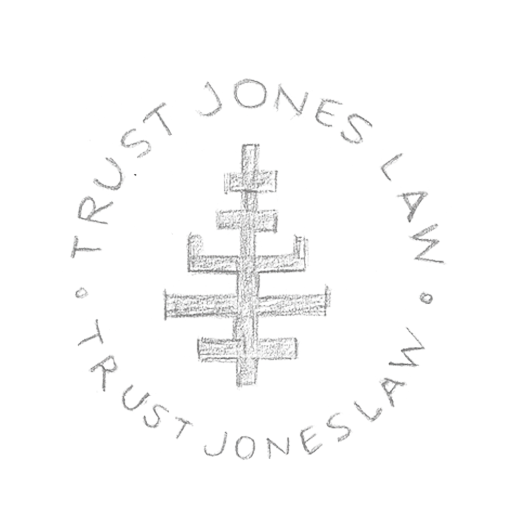
I’m old school, so pencil to paper is always my go-to. I wanted to create a clean, trustworthy visual identity that leaned into symbolism, most notably, the key. This wasn’t a decorative element. It was a metaphor for what Trust Jones Law offers: empowerment, protection, and access.
S O T H E N I W E N T T O T H E D R A W I N G B O A R D


Visual Language as a Signal of Safety

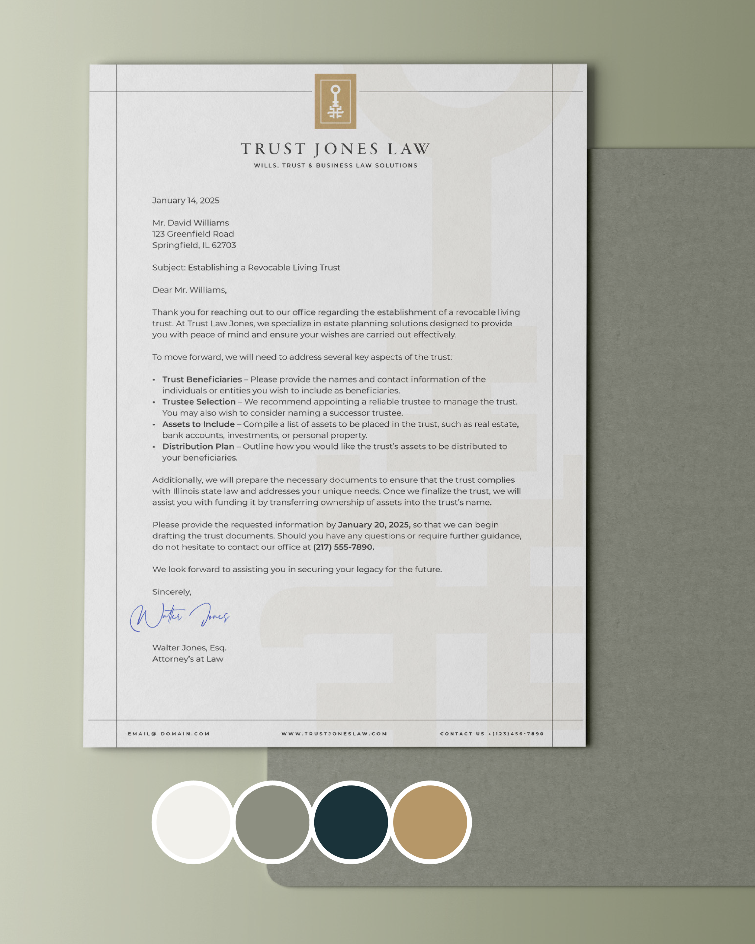
The top of the key represents the client’s role, their goals, and their legacy. The bottom part of the key represents the firm’s role, expertise, advocacy, and ethical grounding. Together, the key represents a partnership: a future unlocked through collaboration.
The Color palettes were chosen with deep intention. The grounded blues and warm neutrals evoke stability, service, and trust, with subtle nods to Walter’s military background, as seen in the organic green, which represents precision and protection as core values. Not to mention, the organic green is also a tribute to his favorite color, adding a personal note of authenticity that gently softens the brand while honoring the man behind it.


W E B S I T E D E S I G N
A guided journey that could support, educate, and convert visitors with confidence.
During our discovery call, Walter was clear from the beginning: he wanted a website that felt clean, direct, and to the point with no fluff, no distractions. That clarity became the backbone of our design approach.
So, I paired bold headlines with simplified navigation and minimal layout structure, creating a streamlined experience that gets users where they need to go fast. Strategic CTAs, such as “Schedule a Consultation,” are placed with intention, while messaging like “Unlock Your Family’s Future” maintains a supportive yet clear tone.
The Result: a clean, confident site that reflects Walter’s straightforward nature, which builds instant trust.

GiaVonni Rié | Brand Designer & Strategist
“Ultimately, this project was about more than just a logo design and a website; it was about legacy. Trust Jones Law helps clients protect what matters most. My goal was to design a brand that could hold that responsibility with care and clarity. One that feels both powerful and personal.”
