
Infinite Catering x Chef Vibes
Industry: Food & Hospitality
Scope: Logo Refresh · Packaging Design · Website Redesign
Chef Rashaun
“They didn’t just elevate my brand, they gave me a foundation that connects my creativity, flavor, and vision.”


Where Flavor Meets Identity
Creative Director’s Journal | Greenwood Heritage Creative Group
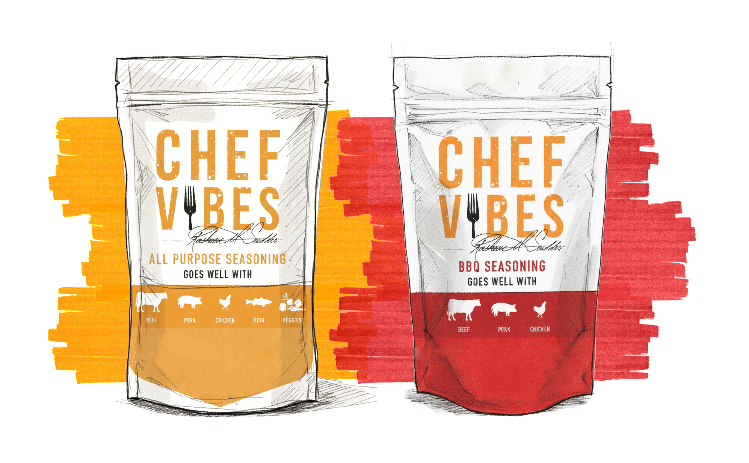
Infinite Catering had a reputation for bold flavors and unforgettable events, but the brand identity, packaging, and website didn’t reflect the elevated culinary artistry behind the name. We set out to refresh Infinite Catering’s logo, craft a signature identity for the Chef Vibes spice and sauce line, and redesign the website into a dynamic, high-converting experience.
Cooking Up a Stronger Brand
S T R A T E G Y G R O U N D E D I N E M P A T H Y
Spice-Inspired Brand Palette
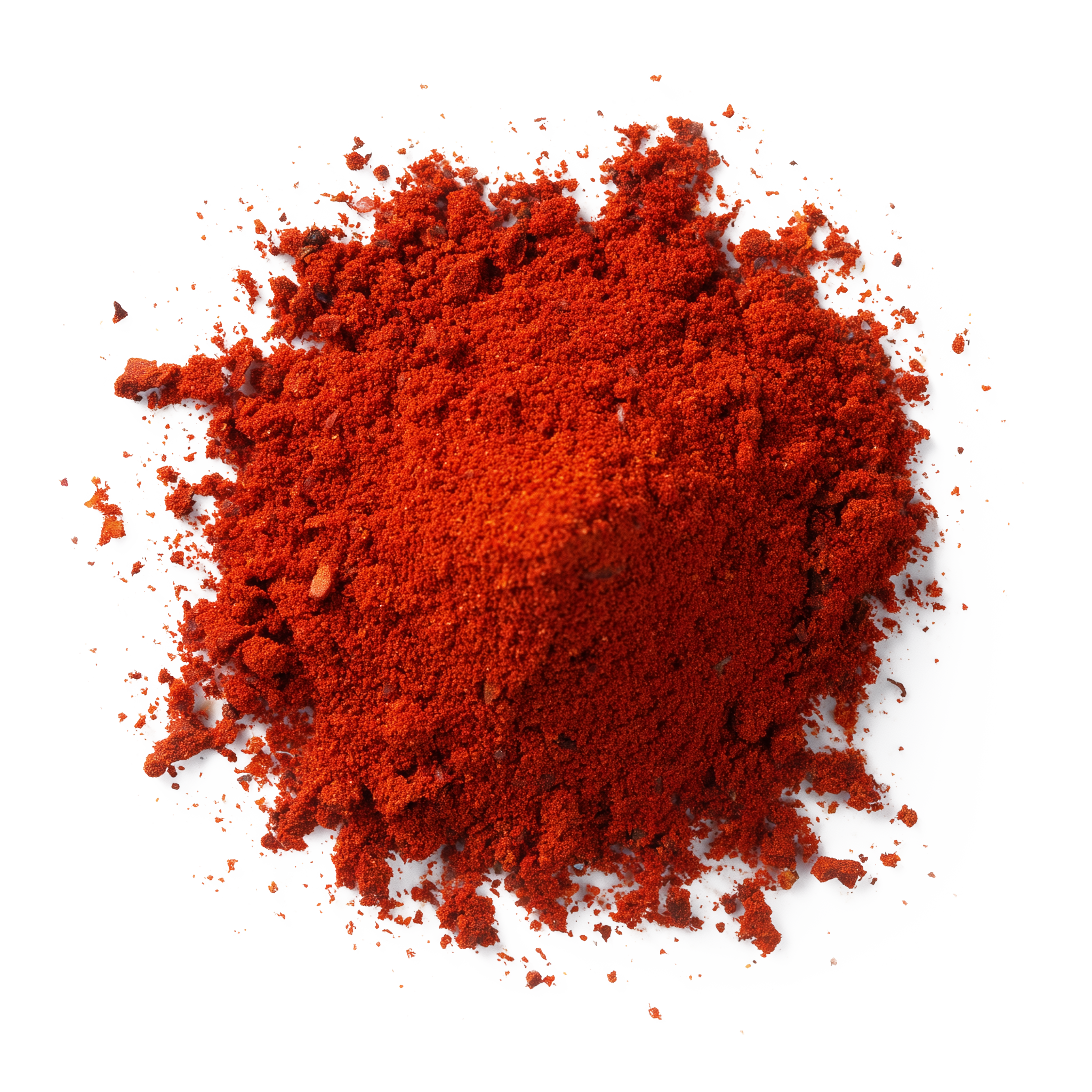
Deep Red
HEX #BA2026
Cayenne Pepper
Bold, fiery, and full of intensity. Just like cayenne, this red embodies the heat and passion at the core of Infinite Catering.

Golden Amber
HEX #F8A32
Turmeric
Warm, earthy, and grounding. This yellow-gold ties to heritage and richness, bringing both brightness and depth to the brand.
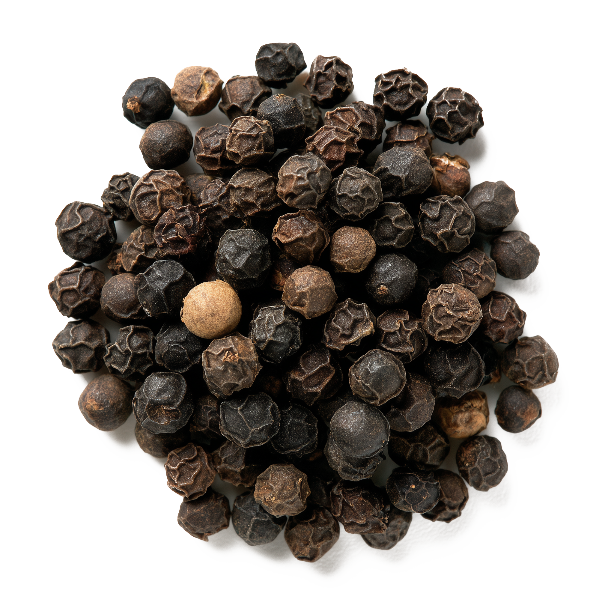
Charcoal Black
HEX #000000
Black Pepper
Classic, essential, and versatile. Black is the timeless base, the seasoning that enhances everything around it.
We set out to refresh Infinite Catering’s logo, craft a signature identity for the Chef Vibes spice and sauce line, and redesign the website into a dynamic, high-converting experience.
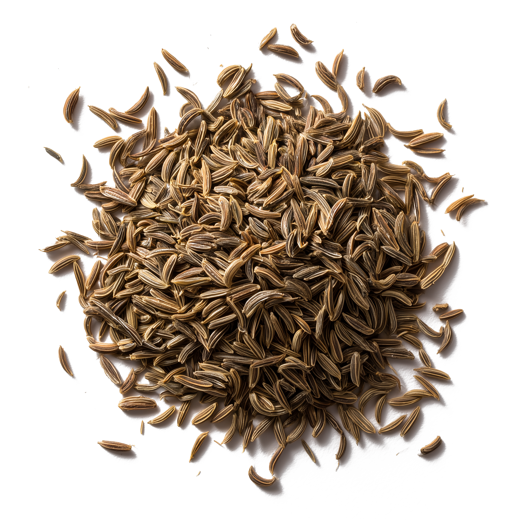
Warm Neutral Gray
HEX #8D8A84
Cumin Seed
Smoky and aromatic. This gray is the steady note that balances the bolder flavors, just as cumin anchors a dish.
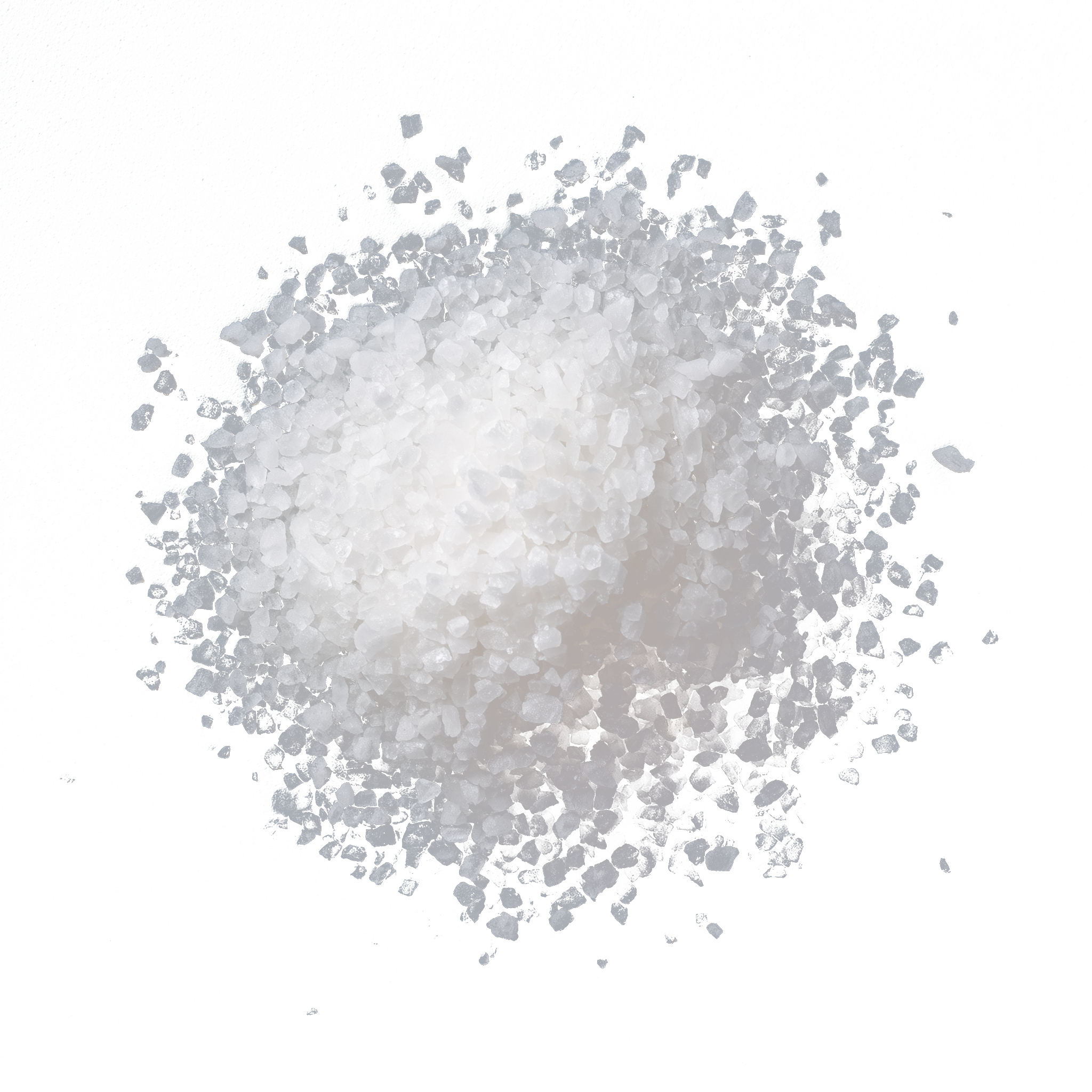
Bright White
HEX #FBFDFD
Sea Salt
Pure, clean, and necessary. White acts as the finishing touch, the highlight that makes flavors (and visuals) come alive.
Visual Language as a Signal of Safety


W E B S I T E D E S I G N
A guided journey that could support, educate, and convert visitors with confidence.
During our discovery call, Walter was clear from the beginning: he wanted a website that felt clean, direct, and to the point, no fluff, no distractions. That clarity became the backbone of my design approach.
So, I paired bold headlines with simplified navigation and minimal layout structure, creating a streamlined experience that gets users where they need to go fast. So, using Strategic CTAs like “Schedule a Consultation” was placed with intention, while messaging such as “Unlock Your Family’s Future” keeps the tone supportive yet clear.
The Result: a clean, simple, confident site that reflects Walter’s straightforward nature and builds instant trust.

GiaVonni Rié | Brand Designer & Strategist
“Ultimately, this project was about more than just a logo design and a website; it was about legacy. Trust Jones Law helps clients protect what matters most. My goal was to design a brand that could hold that responsibility with care and clarity. One that feels both powerful and personal.”
